| Learning Activity – Create a Logo |
| Practical assignment (observation and analysis) |
Develop a name for a dog food product. Design a logo for this product, using full colour. The logo must contain a main visual and typography. (Use the “People Saving Pets” logo as a guide – this does not mean your design should be the same, it is simply an example.) Follow each of the fundamental steps outlined above, in that sequence and take note of what needs to be handed in as you progress through these steps:
|
So, since I’ve done a lot of dog portraits in the past this worked out well.
What I wanted was, as usual to go away from from cliches, people are tired of them. I am very much over the ultra simplistic logo, not everything is Ikea. The age of craftsmanship and quality are behind us it seems and I tend to lean on making logos and marketing high on detail and quality with an Old World appeal.
Why?
Because I can.
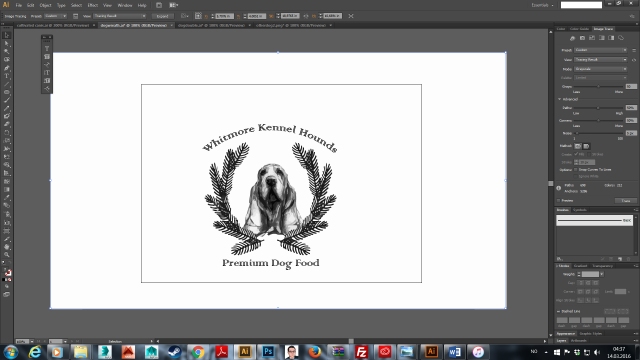
However, I wanted to try a ‘modern’ look so here was my first attempt:
![]()
But I hated it. Why? It looks like I don’t give a fuck.
I wanted something like this:

Yeah I know it’s gin, but making dog food fulfill the tropes of every other dog food out there isn’t going to get you noticed none.
So, No to:
Cartoons.
Bone or steak imagery
Paws.
Words ‘kibble’, ‘buddy’, ‘boy’, ‘k9’, ‘woof’ ect.
Small dogs
Yes to:
Old world imagery
Hunting dogs
Large breeds
Show dogs
Kennel Clubs
Y’know the things people with money do.
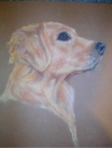
I have many pastels of dogs and some drawings, here are some of them:
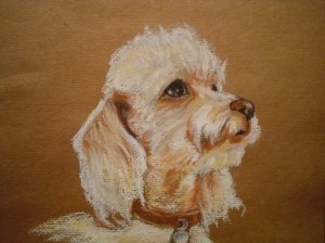
another one that was on my computer but the dog is too small a breed:
I also wanted an elaborate frame:

But I hated that one so I made a standard papal one. With an idea taken from a meme, I drew a very rudimentary version.

Started drawing a more usable version (it’s not done here, but close)


I added a crosshatching look so it appeared engraved. Still hated it.
Tried going in another direction:
Which I did like but it wasn’t something I was in love with.
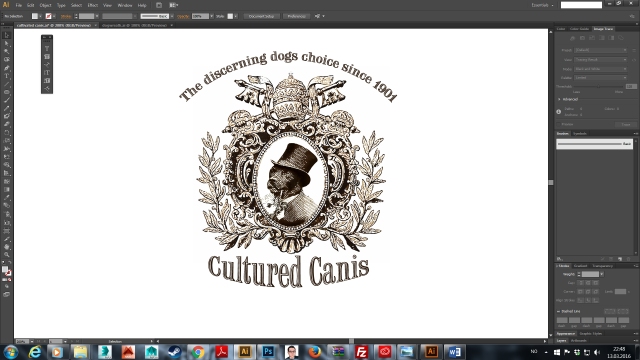
So I decided to draw a version of the lab with the pipe (based off Old Money dog) a and work it in Illustrator. I added a etching, money like quality to the entire drawing. I lost a good deal of the detail when putting the image trace on it, but it ‘looks’ complete and I think I may go with it if nothing better comes along.
I did a variation on same theme but I don’t like it, so much so, no, you can’t see it.
Well okay you can but I will put a huge red cross over it, because I know no one reads this stuff and want to visually communicate that I will not use it.

Of course the real projects will have proper PDFs and such but screen caps will have to do for now.
Ta.
